
14. Quantitative Data Analysis
14.2. Univariate Data Analysis: Analyzing One Variable at a Time
Learning Objective
Understand the various ways that you can conduct a univariate analysis using tables and charts, and how those approaches differ depending on your variable’s level of measurement.
When you start analyzing a dataset, it’s a good idea to spend some time getting to know the variables that will be central to your analysis. This involves analyzing them individually—what we call univariate analysis (that is, an analysis of one variable at a time). While univariate analysis is rarely the goal of academic research, we engage in it all the time to describe the characteristics of our samples—in the process, generating what we call descriptive statistics. We want to know, for instance, what the people we interviewed are like in terms of their personal background and social identities. We want to know what they think about the topics we addressed in our survey. Simple univariate analyses can tell us a great deal about these things, and if we are lucky enough to have a representative sample, we should be able to generalize our results to our target population.
For a categorical variable (that is, a variable measured at the nominal or ordinal level), conducting a univariate analysis typically involves calculating a frequency distribution. Figure 14.8 features the resulting table (a frequency table) for a GSS variable called pray that measures how frequently a respondent prays.
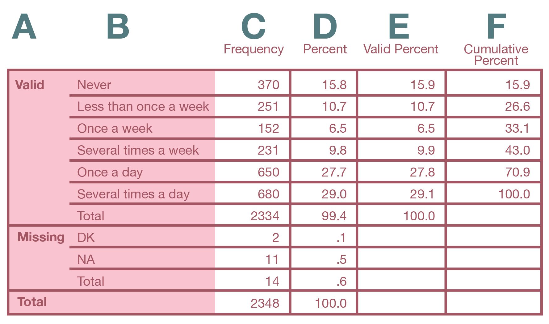
Starting with the far left, here’s what the columns in the frequency table mean.
A: Valid/Missing/Total: The sections of the table describing the valid values, the missing values (here, DK for “Don’t know” and NA for “No answer”), and the totals for all cases, respectively.
B: Labels: Brief descriptions of the attributes of the variable (i.e., the response options).
C: Frequency: The number (or count) of respondents giving each possible response, including any nonresponses designated as missing values.
D: Percent: The percentage of respondents giving each possible response. This percentage includes missing values—which you typically are not interested in.
E: Valid Percent: The percentage of respondents giving each possible response that has been designated a valid value (i.e., not a missing value). This is the information you normally want to use when discussing results.
F: Cumulative Percent: The percentage of respondents giving each valid response added to all of the percentages coming before that one. For example, 73.3 percent of respondents said they pray once a week or more often than that. This percentage was calculated by adding up the “Valid Percent” figures from “Once a week” to “Several times a day.”
When you write up your results in a report, you should summarize for readers the key patterns in your tables. Here are two statements you might make about the table in Figure 14.10 to convey its findings.
- “Most respondents report praying frequently. Specifically, 57 percent pray at least once a day.” We combined two categories here: 28 percent of respondents pray “once a day,” and 29 percent pray “several times a day,” which together equal 57 percent. Note that we also rounded the percentages in the table to the nearest whole percent. That makes the numbers clearer to readers, and we would suggest doing that unless you have many figures that, when rounded, would turn into the same number (which wouldn’t allow you to see any differences between them).
- “The next most prevalent categories are those who pray less than once a week (11 percent) and those who never pray (16 percent).” In this statement, we are making note of additional categories in order of their size. Unless there’s a compelling reason to highlight the smallest groups, it’s okay not to mention them—the reader will just assume the remaining respondents fall in those categories. Alternatively, we could consolidate all the (small) middle categories, which total to 27 percent. Note that for theoretical reasons, you’d probably want to keep the respondents who say they “never” pray as its own category rather than consolidating it: this group is likely to be quite different from, say, those who pray but do so infrequently (for one thing, atheists would fall into the former group but not the latter group).
While in your written interpretation you could mention the results for every single response, we recommend you don’t do that once your response categories number four or more. Instead, combine smaller categories (as we did in the first statement), or leave them out (as we suggested was possible for the second statement).
Frequency distributions for nominal- and ordinal-level variables can be represented visually using a pie chart or bar chart. As shown in Figure 14.11, a pie chart illustrates the valid responses by taking 100 percent as representing the whole pie and giving each value a slice of the pie that matches its portion of the total. This pie chart provides a visualization of the data in our earlier frequency table that reported how often respondents prayed.
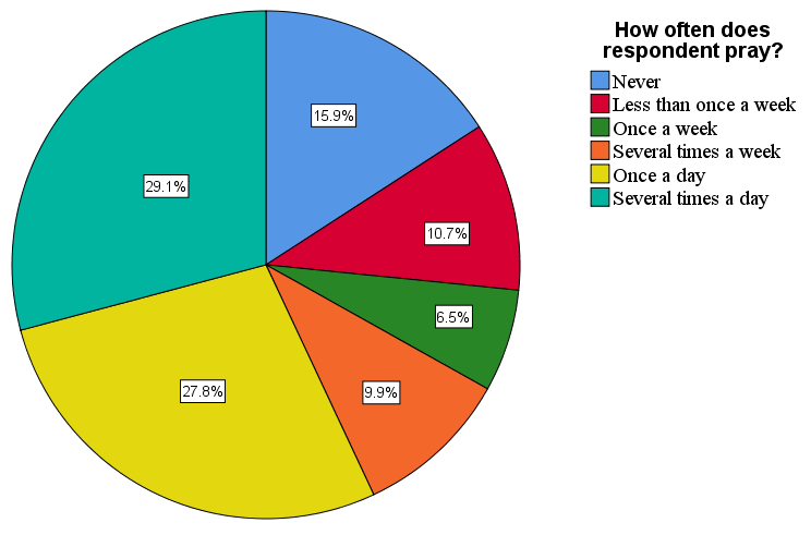
Note that without valid percentages displayed in a pie chart (which we added in Figure 14.11), it is sometimes difficult to say whether one slice is bigger then another similarly sized one. In the figure, for instance, the slices for “Several times a day” and “Once a day” are fairly close in size. This happens frequently with pie charts, especially if the categorical variable we’re using has more than three values. For this reason, social scientists tend to prefer bar charts over pie charts. A bar chart illustrates the frequency distribution by showing the valid values of a variable as vertical or horizontal bars. Figure 14.12 depicts a bar chart for the prayer variable we analyzed earlier.
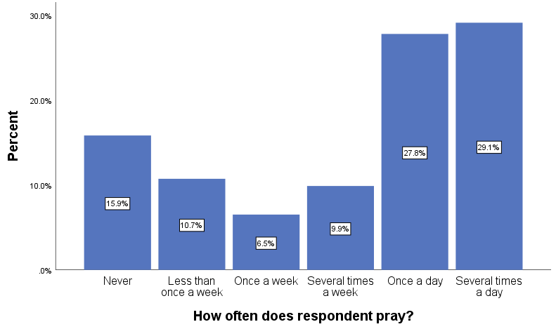
Even if we hadn’t shown the valid percentages in the bar chart, it would be easy to tell whether “Several times a day” or “Once a day” was the larger category, since “Several times a day” is taller. In a bar chart, each bar indicates a value’s relative frequency, and the side-by-side comparison makes determining which value is larger a piece of cake (to continue with our baked-goods motif).
We can also use scale-level variables in frequency distributions and charts. For example, age is a scale-level variable.[1] Its values in our GSS dataset range from 18 to 89. (Note that the distribution starts at age 18 because the GSS collects data only from adults.) That’s a lot of values to show in a frequency table! Luckily, we can use data analysis programs to take the numerous values of a scale-level variable and place them into a smaller number of buckets—which become the categories of our new variable. This allows us to generate a frequency table that’s much easier to understand.
In the table depicted in Figure 14.13, we’ve collapsed (i.e., combined) the 72 different values of our age variable into just three categories. (The minimum number of values for a variable is two, since there’s got to be some “variation” in the attributes of a “variable.”) Essentially, we’ve changed the codes in our variable, moving from a range of 18 to 89 to—for instance—1 to 3 (if we want to use consecutive numbering for our three ordinal categories). We call this process recoding. Social scientists recode variables all the time in order to highlight certain features of the data or simplify their analysis. But note that by recoding the variable and collapsing its original categories, we have sacrificed detail in our data. Specifically, the new variable will only tell us where a person falls within a range—not what their specific age is. For this reason, you typically want to create a new variable rather than replacing the original variable with its recoded structure. That way, you preserve the detail in the original variable.
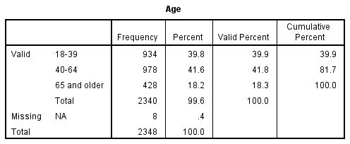
How would we summarize the results of this frequency table? As we did with the frequency table in Figure 14.10, we probably want to start by saying which response category has the highest percentage of respondents, and then move to the next-largest category, and then the smallest. We might say something like this: “Within the GSS sample of U.S. adults, 42 percent of respondents are between the ages of 40 and 64, and 40 percent are between 18 and 39. The oldest age group, those 65 and older, is smaller than the other two (18 percent).”
What if we want to present our frequency distribution for the age variable in a chart? Pie and bar charts are not good options for scale-level variables. For instance, our age variable would have 72 different bars if we created a bar chart for it. We would not be able to label each value properly. Of course, we could create a bar chart with our recoded, ordinal-level age variable, but there are two other types of charts that we can use specifically for scale-level variables: histograms and line graphs.
In a histogram, the height of each bar represents the frequency of the variable values shown, just like in a bar chart. Unlike a bar chart, however, a histogram does not show gaps between the bars, which makes it easy to visualize the shape of the distribution (see the example in Figure 17.14). You wouldn’t bother labeling values in a histogram; instead, you want to see the general trend across values of the variable. Note that data analysis programs like SPSS allow you to change the width of the bars in a histogram (i.e., the size of the bins). You might want to experiment with the size of the bins in your histogram to see if different sizes give you a different sense of the shape of the distribution.
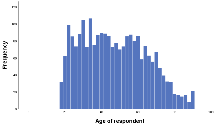
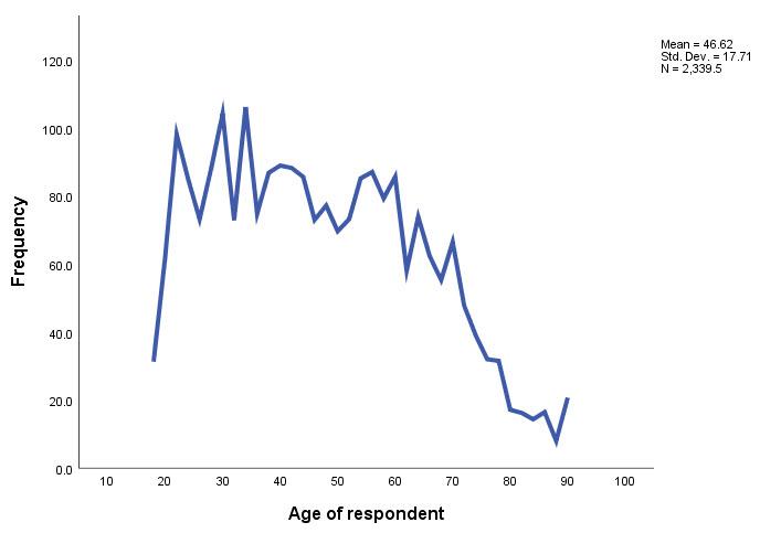
A line graph is another option for scale-level variables. Instead of bars, the height of a continuous line represents the frequency of the values of the variable. As you can see in Figure 17.15, a line graph follows the peaks and valleys of the histogram. (The upturn at the end of the histogram and line graph is due to the fact that the highest possible value for age in GSS 2018 is “89 or older.” Thus, the value contains both respondents who are 89 years old and older respondents.)
Measures of Central Tendency

When conducting univariate analyses to describe their samples, researchers frequently calculate statistics that summarize key characteristics of a variable’s frequency distribution. In this section and the next, we’ll look at the two most common—measures of central tendency and measures of variability. Measures of central tendency give us information about the typical value in a frequency distribution. The most commonly used measures of central tendency are:
Mode: The value that occurs most frequently in the distribution of a variable.
Median: The value that comes closest to splitting the distribution of a variable in half. In other words, 50 percent of cases are below the median and 50 percent are above the median.
Mean: The arithmetic average of the distribution of a variable. The mean is obtained by adding the values of all the cases, then dividing by the total number of cases.
It’s up to you as a researcher to decide which measures of central tendency to include in your report. Important factors in this decision are: (1) the level of measurement of the variable you are analyzing; (2) the nature of your research question; and (3) the shape of the distribution. We will discuss these considerations in turn.
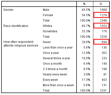
The simplest measure of central tendency is the mode, the most frequently occurring value. You can calculate the mode for variables across all levels of measurement, and it is easy to spot when you are looking at a frequency distribution in a chart or table—it’s the highest bar in a bar chart, and it’s the cell with the highest frequency (count or percentage) in a frequency table. In the frequency table depicted in Figure 14.16, the modes for several GSS variables are shown in red boxes. Note that we have three different variables in this frequency table—each of which has its own mode—but we are still analyzing the variables one at a time (univariate analysis) rather than assessing the relationship between them (bivariate or multivariate analysis).
Determining the mode becomes more complicated, of course, if we are analyzing scale-level variables with a large number of values. For instance, we could generate a (very lengthy) frequency table for our age variable, but then we would have to go through its many rows to find the modal value. Fortunately, data analysis programs can calculate the mode for us, as illustrated in Figure 14.17.
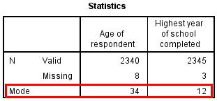
When writing up these results, note that you never need to report the numerical code associated with a categorical variable, even if you are reporting the mode. For instance, for a nominal-level variable like gender, do not report that the mode is “2”; instead, identify the mode as the response option that “2” refers, which for the GSS gender variable is “female.” With scale-level variables, however, we can refer to the numerical values directly: the mode for the age variable is 34 years, and the mode for the educational variable is 12 years, as depicted in Figure 14.17. Note that if two or more values for a given variable have the same frequencies, the distribution will have multiple modes, but SPSS will show only one mode in the table it generates.
The median, or middle value in a distribution, can be used with ordinal- and scale-level variables only. That’s because you’ve got to be able to rank the cases from low to high (or high to low) in order to pick a middle case. SPSS can calculate the median in its frequency tables, as shown in Figure 14.18 for the GSS frequency of prayer variable. The program identifies the median as the value that comes as close as possible to splitting the distribution into two equal halves.
The median can also be thought of as the 50th percentile—the point at which 50 percent of the values in a distribution are at that level or below it. Therefore, in the “Cumulative Percent” column of an SPSS frequency table, the median value would be the value at which the 50th percentile is equaled or exceeded (one reason that this column is actually useful). For instance. you can see in Figure 14.18 that the cumulative percentage rises above 50 on the row for “Once a day,” reaching 70.9. This tells us that “Once a day” is the median value.
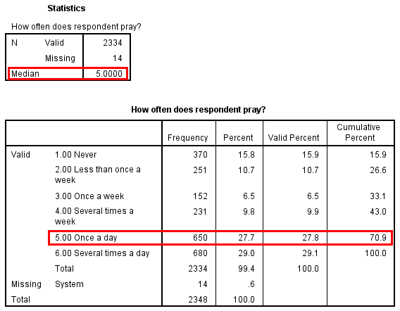
It’s clear that the median for our example—“Once a day”—does not actually split the distribution into two equal parts, but it’s as close as we can get using the categories of this ordinal-level variable. For ordinal variables with relatively few values, the median will probably not be a precise measure of central tendency.
The mean, or arithmetic average, is most appropriately used with scale-level variables. For example, the mean age in our GSS sample is 46.6 years, and the mean number of years of education is 13.7 years. Whether we can calculate a mean for ordinal-level variables is a matter of some social scientific controversy. Statistical purists point out that the values of an ordinal-level variable do not specify the distances between those values, which makes it impossible to determine a mean. Nevertheless, many social scientists dutifully report means for ordinal-level variables, arguing that this measure provides more information than the median or mode do about the distribution of a particular variable. We fall in the latter camp, but we advise you to be cautious when interpreting the mean for an ordinal-level variable. See the sidebar Deeper Dive: Treating Ordinal-Level Variables as Scale-Level Variables for more on this topic.
Table 14.1 summarizes which measures of central tendency we can calculate based on a variable’s level of measurement.
Table 14.1. Measures of Central Tendency for Variables at the Scale, Ordinal, and Nominal Level
|
Measurement Level |
Example Variables |
Mode |
Median |
Mean |
|
Scale (interval or ratio level) |
Age, educational level |
Yes |
Yes |
Yes |
|
Ordinal |
Frequency of attendance at religious services, frequency of prayer |
Yes |
Yes |
With caution! |
|
Nominal |
Gender, race identification |
Yes |
No |
No |
Note that for a scale-level variable, you should also consider the shape of the distribution. In a perfectly symmetric distribution, the mean, median, and mode will all be equal. As shown in the right-hand histogram in Figure 14.19, a distribution with a tail to the right (right-skewed) will have a mean that is higher than the median. As shown in the left-hand histogram, a distribution with a tail to the left (left-skewed) will have a mean that is lower than the median.
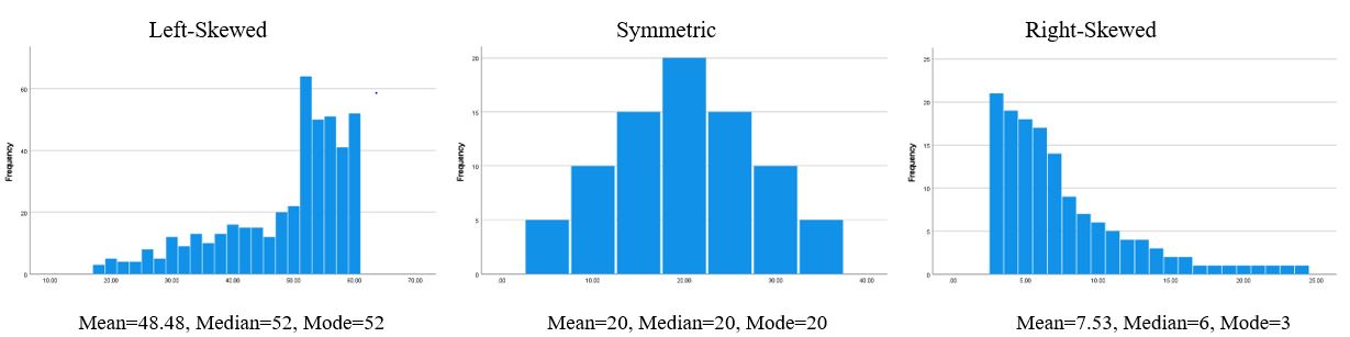
The median will be a better measure of central tendency than the mean to use with a very skewed distribution. For example, if we are analyzing income levels in a national sample of U.S. households, the small number of super-rich people will pull the mean much higher than the median (a right-skewed distribution). That’s why published U.S. Census Bureau figures report the median income instead of the mean income. It is a better measure of what the earnings of an “ordinary” American household look like.
Video 14.5. Measures of Central Tendency. Here’s a good review video for measures of central tendency.
Deeper Dive: Treating Ordinal-Level Variables as Scale-Level Variables
Let’s consider an example to illustrate the benefits and pitfalls of calculating means for ordinal-level variables. Figure 14.20 shows an SPSS statistics table with the mean score for the frequency of prayer variable.[2]
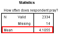
Even though SPSS spits out this calculation on command, you can’t just report the mean frequency of prayer as “4.11.” That’s because the numbers for ordinal-level variables are somewhat arbitrary. Yes, they have to be in order from low to high or high to low, but we don’t know what the numbers mean unless we know which value labels go with which numbers. Let’s review this variable’s numerical codes and its associated response categories:
1 = Never
2 = Less than once a week
3 = Once a week
4 = Several times a week
5 = Once a day
6 = Several times a day
Calculating the mean for this variable assumes that these numerical codes from 1 to 6 are meaningful as numbers. But as you can see, the distances between each of these response options are not precisely determined and not equivalent. “Several” (in “Several times a week” and “Several times a day”) is vague. The distances between 4 (“Several times a week”) and 5 (“Once a day”), and between 5 (“Once a day”) and 6 (“Several times a day”), are both 1 “unit,” but it’s not clear what that “unit” really means, or if moving between these three categories truly covers the same distance. And what does the variable’s mean, “4.11,” represent within this range of values? Specifically, what does moving 0.11 units up the scale—from 4 toward 5—really mean? We don’t know, and therefore we can’t really say much about a value like 4.11—except that the mean frequency of prayer is somewhere between “Several times a week” (coded as 4) and “Once a day” (coded as 5).
In general, we would say that the mean can be used with ordinal-level variables with the caution that it must be interpreted in light of the value labels below and above that number. We can say the mean falls somewhere between two values, but we can’t say anything more than that. Whether it’s even useful to calculate the mean, then, is a judgment call.
We would say that the means for four- or five-point Likert scales and similar ranges of responses are a bit more intuitive. That’s because the Likert scale responses (on a four-point scale, “Strongly disagree,” “Disagree,” “Agree,” “Strongly agree”) are balanced on either side, and the responses appear to move steadily from lesser to greater intensity (of agreement or disagreement, depending on the scale). Therefore, it is easier to assume that moving from “Strongly disagree” to “Disagree” is equivalent to moving from “Strongly agree” to “Agree,” or that a 0.5 difference between a value of 1 and 1.5 is something similar to a 0.5 difference between a value of 2 and 2.5.
In any case, you will frequently see social scientists calculating means for Likert-scale variables. Sometimes, ordinal-level variables will even be used in multivariate analyses that apply techniques appropriate only for scale-level variables. You should use your own judgment about whether those uses are justified, keeping the pitfalls we’ve mentioned in mind.
Measures of Variability

Let’s say you and some friends are on top of a cliff overlooking the ocean and are deciding whether to jump into the water. One of your friends has researched the beach and learned that the average depth of the ocean at this point is 20 feet—clearly, deep enough for a cannonball dive. Does that give you sufficient information to hurl yourself into the ocean?
No. Even if 20 feet is the mean, the ocean depth could range from, say, three feet to 30 feet. In other words, there’s likely to be variability around the mean score. The ocean at this point on the shoreline probably isn’t 20 feet deep everywhere. For the sake of that beautiful social scientist brain of yours, at least do more research before you leap.
Getting a good sense of your data requires you to go well beyond the usual statistical suspects—mean and median—and measure the data’s variability as well. Common statistics in this area include:
Range: The distance between the lowest and highest values in a distribution.
Interquartile range (IQR): The distance between the values at the 25th percentile and the 75th percentile in a distribution. The 25th percentile is the point at which 25 percent of the values in a distribution are at that level or below it. The 75th percentile is the point at which 75 percent of the values in a distribution are at that level or below it. In other words, the IQR spans the middle 50 percent of a distribution.
Standard deviation (SD): A measure of the average distance of all scores from the mean score. This calculation takes every single value in the distribution into consideration.
Index of qualitative variation (IQV): A measure of how much the distribution varies from one in which all cases are concentrated in one category.
As for measures of central tendency, which measures of variability are appropriate to use depends on the measurement level of the variable you are analyzing, as indicated in Table 14.2.
Table 14.2. Measures of Variability for Variables at the Scale, Ordinal, and Nominal Level
|
Measurement Level |
Variable Examples |
Index of Qualitative Variation |
Range |
Interquartile Range |
Standard Deviation |
|
Scale (interval or ratio level) |
Age, educational level |
No |
Yes |
Yes |
Yes |
|
Ordinal |
Frequency of attendance at religious services, frequency of prayer |
No |
Yes |
Yes |
With caution! |
|
Nominal |
Gender, race identification |
Yes |
No |
No |
No |
Table 14.3 breaks down the measures of variability for some of the GSS variables we’ve been using. The first two variables, age of respondent and highest year of school completed, are scale-level, so their figures can be interpreted with no additional information. For example, the highest number of years of school completed is 20, and the lowest is zero (0), so the range is highest minus lowest, which equals 20 years.[3] Though the range is easy to calculate, exceptionally high or low numbers (called outliers) can inflate it considerably. For example, if only one person in the GSS sample had completed 35 years of formal schooling, the range would be 35 years, which does not convey the narrower variability of most people’s education in the sample. (To a lesser extent, outliers can also affect the standard deviation of a distribution.)
Table 14.3. Range, IQR, and Standard Deviation for Selected GSS Variables
|
Variables |
Range |
Interquartile Range |
Standard Deviation |
|
Age of respondent |
71 (18–89) |
28 (32–60) |
17.71 |
|
Highest year of school completed |
20 (0–20) |
4 (12–16) |
3.02 |
|
How often the respondent attends religious services |
8 (0–8) |
6 (0–6) |
2.82 |
|
How often does the respondent pray? |
5 (1–6) |
4 (2–6) |
1.83 |
|
Respondent’s highest degree |
4 (0–4) |
2 (1–3) |
1.22 |
Measures of variability for ordinal-level variables are more complicated to interpret. For instance, our variable for attending religious services goes from 0 to 8, but a range of “8” is meaningless without knowing the actual response options the numerical codes refer to. (As it turns out, 0 means “Never” and 8 means “Several times a week.”) The IQR is based on percentiles, so we run into the same issue with ordinal-level variables when we calculate it as we did previously with the median. Though the program will do your bidding and output numbers for these measures of variability, the results won’t be very helpful in understanding the nature of an ordinal-level variable.
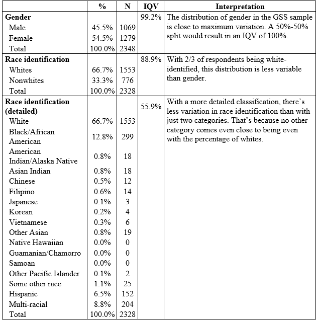
The index of qualitative variation (IQV) is the only measure of variability appropriate for nominal-level variables.[4] When expressed as a percentage, as in Table 14.4, the IQV can vary between 0 and 100 percent. The closer to zero percent the IQV is, the higher the percentage of cases in just one category—until ultimately all cases are in a single category, indicating no variation at all in the distribution. The closer to 100 percent, the more the cases are distributed evenly across the categories—until ultimately each one has an equal number of cases, indicating maximum variation.
Table 14.4. Frequency Distribution and Index of Qualitative Variation (IQV) for Gender and Race
Deeper Dive: Measures of Variability
Here are suggested videos providing more detail about measures of variability. These work best when viewed in the order shown.
Understanding Frequency Tables
You now have a good idea of how some basic tables and charts look in SPSS. If you try out another data analysis program, such as SAS or Stata, the output you generate won’t look exactly like what we showed you. The same is true of the tables and charts you’ll encounter in the results sections of quantitative research papers. You’ll need to take advanced coursework in statistical analysis to fully understand them, much less the terminology, symbols, and equations littered throughout the text. For now, our hope is that you learn enough fundamentals about quantitative data analysis that you can get the gist of what a researcher is trying to convey. We also hope to get you to the point that you can write up a few sentences for each analysis that summarizes its conclusions concisely but with adequate detail for your audience. In this and subsequent sidebars, we’ll discuss some basic principles for making sense of quantitative tables and writing up your own interpretation of their results. We’ll start with frequency tables.

Government agencies and nonacademic research outlets often use frequency tables in their publications to provide descriptive statistics that describe a relevant population. Frequency tables are usually not the focus of academic papers—as we’ve pointed out, most academic sociologists seek to identify and explain relationships between two or more variables, generally speaking. However, you will often see frequency tables in a paper’s methods section or the first part of its results section. The typical intent behind such a table is to offer a concise summary of the characteristics of the study’s sample. Figure 14.21 presents a table from an article by Bob Lee and his coauthors (2011:1233), which examined barriers encountered by older adults in using computer-mediated information technology.
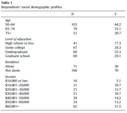
When looking at any frequency table, your first task should be to determine what sample and/or population is being described, and what variable or variables are being featured. Let’s take this approach for the example table. As a best practice, data tables will describe the sample briefly in a note that appears right under the data. This frequency table did not do that, meaning you would have to search the paper’s methods section to learn that information. There, you would learn that this table is describing a nonprobability sample of 243 interviewees: older adults living at several senior facilities in northwest Ohio. The table title tells you that the distributions being displayed are for “social demographic” variables: age, education, income, and whether the person lives alone.
Now let’s break down the table’s data. The variables and their corresponding response options are labeled in the left column. The middle column, “N,” lists the number of cases that fall into the response category noted on the left. The right column, “%,” tells you the percentage of all cases that the count for that category represents. Note that when you add the percentages of all the response option rows for a single variable, they should equal 100 percent or something close. (In the latter case, the table note might warn readers: “Percentages may not sum to 100 due to rounding.”)
Also note that this frequency table rounds percentages to a tenth of a percent. These authors are being particularly precise. For a sample this small—just a couple hundred respondents—most authors would choose to round the percentages to the nearest whole number. Either approach is generally fine, though you would want to be more precise if it is important to your research to distinguish between, say, 13.6 percent versus 14.4 percent (which, if rounded to whole numbers., would both be 14 percent).
Another best practice for data tables is to include a table note that lists the total sample size (if that number isn’t already listed in a “total” row in the table body) and also mentions how many missing values were recorded (which provides some indication about the quality of the survey). The example table doesn’t do these things, but elsewhere in the article Lee and his collaborators (2011:1233) report they analyzed 243 surveys in total. The table shows 233 responses for the age question, so we can conclude that 10 respondents did not answer this question. That suggests our missing data for this question accounts for a little over 4 percent of the total sample—not too bad. While results like this would not make you doubt the overall quality of the survey, it helps to know where you might want to be cautious in your interpretations.
When you include a table in your own paper, you will want to break down its key findings in the main test. Don’t just leave it to the reader to decipher the table. For interpreting tables, we recommend you follow the GEE (Generalization, Example, Exceptions) strategy described by Jane Miller (2015), which starts by generalizing the patterns, moves to providing one or more examples, and then concludes by mentioning any noteworthy exceptions. For univariate variables, the “generalization” step can be consolidated with the “example” step: you can flag the largest category or categories (generalization) and include their specific percentages (example), preferably mentioning them in descending order of size. You can also mention the percentages in parentheses after the category names. For instance, you might describe the educational attainment of the older adult sample described in Figure 14.21 in the following way: “The sample was well-educated, with a plurality of respondents having a graduate degree (29.1 percent); another 25.3 percent had an undergraduate degree.”
When you are interpreting a univariate table in prose, you do not have to list every single percentage that was listed in the table. The last percentage is obvious from context: if you list three out of four percentages, for instance, the percentage for the last category will just be the remaining amount for their sum to reach 100 percent. Furthermore, smaller categories may not be worth mentioning, especially if the variable has many different values.
The “exceptions” step of the GEE approach is often unnecessary when you are conducting a simple univariate analysis. That said, you might use the opportunity to flag a percentage that was surprisingly high or low. For instance, because the older adult sample was much more educated than the overall population of U.S. adults (who largely do not have college degrees), you might want to add another sentence to the earlier description: “Only 17.3 percent of respondents had a high school diploma or less education.”
Quantifying and Comparing Life Outcomes: A Q&A with Elyas Bakhtiari
Elyas Bakhtiari is an assistant professor in the Department of Sociology at the College of William and Mary. His research examines how mortality rates and other health outcomes vary depending on factors like how countries form racial boundaries, how they incorporate immigrants into mainstream society, and how their social and political institutions shape the fundamental causes of health and illness. In other work, Bakhtiari draws on historical demographic records and machine learning to examine health outcomes among southern and eastern European immigrants in the early 1900s, Middle Eastern and North African populations after 2001, and other populations whose experiences of the U.S. racial and ethnic hierarchy was more complex than their official racial classification as “white” would indicate. His work has been published in journals like American Behavioral Scientist, Social Science and Medicine, the Journal of Health and Social Behavior, and the Journal of Racial and Ethnic Health Disparities.
How did you get into sociology?
I started out as an engineering major, and switched to sociology in part because I found it to be more intellectually stimulating and challenging in many ways. That’s not to say undergraduate sociology courses were always harder than your average engineering course. But when dealing with technical problems, there are often clear and knowable answers that can be uncovered with enough analysis and background knowledge. With social problems, though, there often isn’t a clear answer or single way to understand them—they result from thousands or millions of individuals consciously interacting in complex social systems.
I was drawn to sociology because understanding complex social phenomena not only seemed interesting, but also important. Take something like climate change. We can solve some of the technical challenges by developing new technologies. But where we have really struggled is with collective action and behavior change, which are fundamentally social problems. It’s the same thing with Covid-19. On the one hand, there’s the technical achievement of developing numerous vaccines relatively quickly. On the other hand, there’s the stubborn challenge of convincing enough people to take a vaccine that could save their lives. Sociology offers tools for understanding some of the major challenges of our time.
How do you use quantitative data in your own research?
I use quantitative data to study inequalities in health and mortality outcomes. Some of my work relies on large-scale surveys, in which people’s answers to questions about their health, behaviors, and demographic characteristics have been quantified. I also rely on health records and vital statistics data, which includes birth and death records for entire populations. By analyzing patterns in how health and mortality outcomes vary, my goal is to understand how people’s health is affected by aspects of their social lives—particularly their experiences with racism, migration, and social inequality.
What advantages do you think quantitative research offers over other methodological approaches?
Quantitative research allows us to systematically compare outcomes. A lot of sociology focuses on how complex social processes can affect people’s lives and life chances. If you’re interested in a process, qualitative data can often provide a rich and nuanced perspective. But if you want to understand the outcomes of a process, you typically need some kind of quantified measure that allows for comparisons. In my work on health and mortality outcomes, I’m able to see how social processes have a profound impact on the quality and length of people’s lives. Ideally, these two types of methods—qualitative and quantitative—work together to help us understand both the causes and consequences of social phenomena.
In your research, you have examined health and social inequalities in the United States and in Europe. Why do you think it’s important to conduct comparative and cross-national research on inequalities?
Comparison can help us understand both the generalizability and variability of the social processes that affect population health—or any social phenomenon, really. Consider the relationship between health and socioeconomic status—that is, people’s income and education levels. Cross-national comparisons have revealed that individuals with higher socioeconomic status have better health and longer lives across contexts, including in countries with universal health care or more equal income distributions. This is an important finding for advancing our theories about how socioeconomic status acts as a fundamental cause of health. However, we also see differences in the degree of the association across contexts. The relative health gaps between the high and low ends of the socioeconomic scale are larger in some countries than in others. This variability opens up a new set of research questions about what policies or social factors might shrink or widen relative health inequalities. Sociologists are often interested in how individuals are influenced by social contexts, and one of the clearest ways to see that is by comparing across different contexts.
What data and analytical challenges have you encountered when conducting comparative research?
It can sometimes be hard to find the data necessary to answer a comparative question. I am interested in how racism and ethnic discrimination affect health across national contexts, but some countries don’t collect information on race or ethnicity in their censuses. Or even if data is available, each country has unique demographics, stratification systems, and constructed identities, which can make straightforward comparisons difficult. Luckily, there are some cross-national surveys that attempt to address these challenges by asking consistent questions about minority status across many countries. Although comparative questions are important, there is often a trade-off between breadth and depth when your data source spans a lot of different societies.
What advice do you have for sociology students who want to strengthen their quantitative skills?
The best way to strengthen quantitative skills is to never stop learning. I am constantly learning new quantitative skills during the course of my research. I try to choose my method based on what is best suited to answer the research question I’m interested in, and often that means learning a method I haven’t used before. There are so many great resources for learning new methods now: coding tutorials, virtual classes, online forums, and even replication packages that allow you to see exactly how other researchers did their analysis. Although you can learn the foundational skills from your first statistics classes, the best way to build on that foundation is to put those skills into practice with an actual research project.
Key Takeaways
- Use frequency tables and bar charts to display the frequency distributions of nominal-level and ordinal-level variables in terms of both counts and percentages.
- It may be impractical to present scale-level data in a frequency table, but we can still calculate useful statistics about these variables, including the mean, median, and standard deviation.
- Scale-level data can be visualized using a histogram or line graph, which will give you a sense of the shape of the distribution—whether it is left-skewed, symmetrical, or right-skewed.
- The age variable in the GSS is scale level from 18 to 88 (with one year separating each value), but the highest value possible is 89–which represents not only those aged 89 but also any older respondents. For that reason, the GSS age variable is actually an ordinal-level variable. That said, we can treat it as scale level for practical purposes, as we do in this chapter. ↵
- The original numerical coding for the GSS frequency of prayer variable used 1 for “Several times a day” and 6 for “Never.” For this example, we’ve reversed the ordering of the response options so that 6 now indicates “Several times a day” and 1 indicates “Never.” We’ve recoded the variable in this way to make it more intuitive, with higher numerical values signifying a higher frequency of prayer. ↵
- Like age, the GSS variable for years of formal education combines the highest values into one value (20+ years). Therefore, it is not a true scale-level variable, but it can be treated as one for most analyses. ↵
- SPSS does not directly calculate the IQV. However, you can find calculators on the internet or enter the formula into a spreadsheet. ↵
