
14. Quantitative Data Analysis
14.3. Bivariate Data Analysis: Crosstabulations and Chi-Square

Learning Objectives
- Understand how to conduct and interpret a crosstabulation analysis of two categorical variables.
- Explain the logic behind null hypothesis testing and use it to interpret the results of a chi-square test.
So far, we have been conducting univariate analysis, generating statistics for one variable at a time. Now we will move into bivariate analysis, which is about examining the relationship between two variables. While we are far from being able to infer causality at this point, we should start thinking in terms of independent and dependent variables—specifically, what possible effect our independent variable has on our dependent variable. (Recall that an independent variable, also known as an explanatory variable, is the variable we think may influence or explain another variable, the dependent variable or outcome variable.)
Let’s say you have a general interest in learning about which types of people are more likely to be religious. You could develop your own survey to ask people about (1) their personal background and (2) their religious beliefs, and then use statistical analysis to see how these two sets of variables are related. Alternatively, you could find a quantitative dataset that already contains variables that cover this ground, and then start your analysis from there. As it turns out, there are many variables in the General Social Survey that relate to the importance of religion in respondents’ lives (which would be your dependent variables for this particular analysis). But how do you choose independent variables from the many variables in the GSS that could give you a sense of a respondent’s personal background? To put this question in another way, which demographic variables are likely to affect how devout a person is?
In situations like this, you should let theory guide you. Think about the literature you have read about the factors that influence people’s religious beliefs. Which variables relating to people’s identities have been brought up in past research? Use your creativity and logic to see how you might build on those theories and apply them to your own analysis.
Throughout the rest of this chapter, we will use an existing theory—“comfort theory”—to help us select independent variables and contextualize our bivariate analysis. According to this classic explanation for religious participation, the most devout individuals tend to be those whose “life situations most deprive them of satisfaction and fulfillment in the secular society” that surrounds them (Glock, Ringer, and Babbie 1967:107–8). In response, they turn to religion “for comfort and substitute rewards.”
Working logically from this statement, we reason that members of marginalized social groups would be more likely to feel deprived of satisfaction and fulfillment. Therefore, they should also be more likely to turn to religion for comfort and sustenance.[1] To test this theory, we need to find some variables in the GSS data file that will allow us to identify more or less marginalized people. In the following list are the independent variables we plan to use, all of which we covered earlier in our univariate analyses. (Note that the corresponding variable name in the GSS data file is provided in parentheses, in case you want to follow along in SPSS.)
- Age (age): Elderly people have lower social status than young people.
- Gender (sex): Women have lower social status than men.[2]
- Race identification (racecen1, racecen2, racecen3): People identifying as members of racial or ethnic minority groups have lower social status than people identifying as members of the majority group.[3]
- Educational level (degree, educ): People with less formal education have lower social status than people with more education.[4]
To test the predictions of comfort theory, we also need to select dependent variables that plausibly capture what it means to turn to religion for “comfort and substitute rewards.” There are numerous variables about religion to choose from in the GSS, but we have selected two that get at higher and lower levels of participation in religious activities. Since these dependent variables are a bit less generic than our independent variables, this time we have included the exact text of our questions—which is crucial to refer to whenever you interpret the results of an analysis.
- Frequency of attending religious services (attend): “How often do you attend religious services?” This question gets at the extent to which a person is willing to publicly express their commitment to their religion.
- Frequency of prayer (pray): “About how often do you pray?” This question gets at the extent to which a person expresses their religious devotion in private.
Let’s pause here to acknowledge the deductive approach we are pursuing here with our bivariate analysis. First, we drew upon previous research to identify a relevant theory, the comfort theory of participation in religion. We then used that theory to help us settle upon sets of independent and dependent variables. We selected four independent variables that serve as reasonable indicators of whether our respondents are members of marginalized groups. And we selected two dependent variables that serve as reasonable indicators of the importance of religion in their lives.
Next, we will generate hypotheses from our theory—specific and testable propositions about what the empirical results of a study will be if the underlying theory is correct. As we discussed in Chapter 5: Research Design, our hypotheses should clearly and unambiguously state what we expect to find when we do the data analysis. Here are some hypotheses about how our independent variables are expected to influence our dependent variables if comfort theory does indeed hold up in this context.
- The higher a respondent’s age, the higher their frequency of attending religious services.
- Women will have a higher frequency of attending religious services than men will.
- Nonwhites will have a higher frequency of attending religious services than whites will.
- The lower the respondent’s educational level, the higher their frequency of attending religious services.
We can create another set of four hypotheses by swapping out the variable for frequency of attending religious services with the second dependent variable, frequency of prayer—for instance, “Women will have a higher frequency of prayer than men will.” Note as well that all these hypotheses can be stated in the reverse: “The lower the age, the lower the frequency of attending religious services.”
Now it’s time to analyze our data and test our hypotheses. Before we do that, however, we should point out one more thing. While quantitative researchers frequently take the deductive approach to their data analysis that we have just outlined, induction is also an option. Working inductively, for instance, we could explore our data to examine a wide variety of variables that might influence a person’s degree of religious faith. We could develop a theory based on the results of this analysis, which might extend comfort theory or cover entirely different ground. (For more on the inductive approach, refer back to Chapter 4: Research Questions.)
Bivariate Crosstabulation: Analyzing Two Categorical Variables
The type of bivariate analysis we can conduct depends on the level of measurement of the independent and dependent variables we are analyzing. When all our variables are categorical variables (measured at the nominal or ordinal level), we can use crosstabulation analysis. This analytical procedure creates a table showing how the categories of multiple variables intersect. We could throw any two variables into this table just to see if a relationship exists between them, but typically we have an independent variable and a dependent variable in mind, with the goal of examining the possible effect of the former on the latter. In this section, we will use crosstabulation tables to evaluate the hypotheses we derived from comfort theory, examining how our independent variables (IVs) of age, race, gender, and education relate to our dependent variables (DVs) of frequency of attending religious services and frequency of prayer. These tables—usually just called crosstabs—also go by the names contingency tables and two-way tables (the latter when they encompass just two variables).
Crosstabulation analysis is a good choice for examining relationships between an independent variable and dependent variable when two conditions are met: (1) as we already mentioned, both variables should be measured at the nominal or ordinal level; and (2) both variables should have a narrow range of possible values (i.e., few response options for each survey question)—typically, between two and five values each. Condition #2 means that if your categorical variable happens to have numerous response categories, you’ll want to collapse those categories to only a few. For instance, if you were collapsing the many categories included in the GSS for its racecen1 variable (which includes all of the race options on the U.S. Census form), you could keep the “White” and “Black” categories as they are, but combine (collapse) all the other race categories into an “Other” category. (In fact, those are the three categories in the original GSS race variable, which has stayed more or less consistent since the survey began in 1972.)
Condition #1—that your crosstab’s variables should be nominal or ordinal level—suggest that you can’t include a scale-level variable like the GSS age variable in its raw form. However, you can easily convert a scale-level variable into an ordinal-level variable that can be analyzed with a crosstab. To do so, you will need to collapse the many response categories of your scale-level variable to only a few. You can think of these new, consolidated categories as buckets where you are tossing in a range of values (in fact, one term for them is bins). For example, we might sort the values of our scale-level variable age into just four broad bins: 18 to 34, 35 to 49, 50 to 64, and 65 and over.
Collapsing and combining values of a variable is a common method of recoding. When you recode a variable, you change the original values to make them easier to analyze. Once we recode the age in the way we have described, we can still rank our respondents by their ages from low to high (or high to low) because our new variable is ordinal-level. But we have lost the more precise measurement of exact years. (This is one reason that you generally do not want to replace an existing variable with a recoded one; instead, create a new variable and save the old one in case you realize later that you need greater precision.)
Let’s go ahead and generate a crosstab showing the relationship between gender (IV) and frequency of prayer (DV). Gender is nominal level and has two response categories. Frequency of prayer is ordinal level and has six categories—not ideal, but okay for this example. Will the analysis support our hypothesis that women, the historically marginalized group, will have higher frequencies of prayer than men?
Figure 14.22 depicts the crosstab we generated in SPSS. For this example, we chose to put our dependent variable in the rows, and our independent variable in the columns. Structuring your table in this way is probably the approach you want to use when you’re first learning to do crosstabulation analysis, but we’ll show you later what happens when you swap what variables go in the table’s rows and columns.
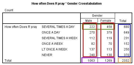
There’s a lot going on in this crosstab. Let’s break down its different elements:
Title: For crosstabs, SPSS automatically generates a title. The default title is in the format “[Row variable] * [Column variable] Crosstabulation.” The asterisk stands for “by”—as in “length by width” (rows by columns). You can edit the table title in SPSS (or whatever program you are using) to provide a more descriptive title, perhaps something like “How often respondent prays by their gender” or “Frequency of prayer by gender.”
Red boxes: Twelve table cells where the two gender categories intersect with the six prayer categories. In each cell is the count of people who fit the conditions in that column and that row. Let’s take the two cells in the green box as examples. The left cell indicates that 222 men said they pray several times a day. The right cell indicates that 458 women said they pray several times a day.
Purple box: Totals for the gender categories. The left cell indicates that 1,063 men answered the prayer question (with any of the six response options), while the right cell indicates that 1,269 women did so.
Blue box: Totals for the prayer categories. The top cell indicates that 680 respondents (both men and women) said they pray several times a day, while the bottom cell indicates that 370 respondents said they never pray.
Orange box: Total number of responses to the prayer question, counting both men and women. This is the sum of the counts in all 12 intersecting cells (the red boxes).
Based on the cells in the green box, we know that more women than men in our sample pray several times a day. Does this mean that in the U.S. adult population (the sample’s target population) women are more likely than men to pray several times a day? Not necessarily. The cells in the purple box tell us that about 200 more women than men answered the prayer questions. The greater number of women than men in that “Several times a day” category might just be because there are more women than men in our sample. We need to take into consideration the size of each of these groups when considering whether any patterns we observe in the cell counts are meaningful.
Luckily, there’s an easy fix for this. We simply add column percentages to the table—that is, percentaging each cell by using its count as the numerator and the column total as the denominator. Since we put the independent variable, the respondent’s gender, in the crosstab’s columns, we use the totals at the bottom of the “Male” and “Female” columns—1,063 and 1,269, respectively—to calculate the cell percentages. (Each column total serves as the percentage base—the denominator when we calculate the percentage for each cell in that column.) Figure 14.23 presents the revised crosstab percentaged by columns.
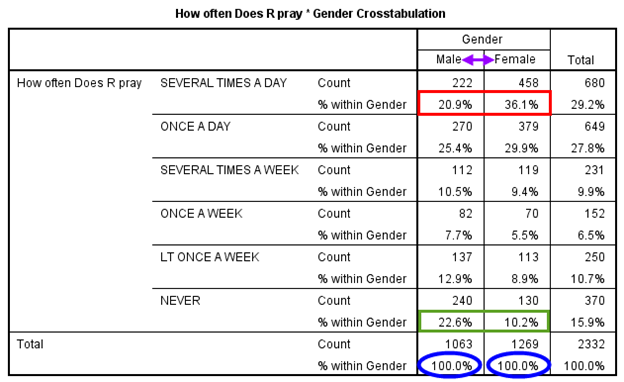
By adding percentages, we are finally able to compare men and women by how frequently they pray in an apples-to-apples fashion. As shown in the blue ovals, the percentages for the two groups sum up to 100 percent. That’s what makes it possible to compare them even though we have 200 more women than men in our sample: the percentages show us what the distribution would be like if each group had the same number of respondents. (It’s as if they each had 100 respondents!)
With the percentages in place, we can see how men and women differ across the categories of the dependent variable, frequency of prayer. But which of the six response categories should we focus on? It depends on our hypothesis. In this example, our hypothesis is that women will pray more frequently than men do, so we might want to focus on the category indicating the highest frequency of prayer, “Several times a day.” Did more women pick this option? Yes, they did (see the cells in the red box), which is in line with our theory. We might also want to examine the category for the lowest frequency of prayer (“Never”). Did more men pick this option? Yes, they did (see the cells in the green box), providing more support for our hypothesis.
Note that having many response categories complicates the sort of comparison we’ve been talking about. For instance, what if fairly similar proportions of women and men said they prayed several times a day, but many more women than men prayed once a day? Is that evidence in support of our hypothesis? Perhaps, and in this case we might want to collapse our response options to fewer categories so we are better able to see overall patterns. After all, when a survey question has numerous response options, it is common for an extreme option to attract very few respondents—making it hard to know if any differences across groups in choosing that extreme option really tell us something meaningful. In this case, we might combine the extreme response category with a closely related category. For example, if there were very few cases in the “Several times a day” category, we could merge it with “Once a day” and then examine differences between men and women in the combined “At least once a day” category. Likewise, if we were dealing with a Likert-scale variable, we might want to combine the “Strongly agree” and “Agree” response options into a single value (perhaps just called “Agree”), and do the same for “Strongly disagree” and “Disagree.” Then we’d be accounting for how the independent variable might affect overall agreement or disagreement with the statement in question, rather than focusing narrowly on the IV’s influence on a single (extreme) response option like “Strongly agree.”
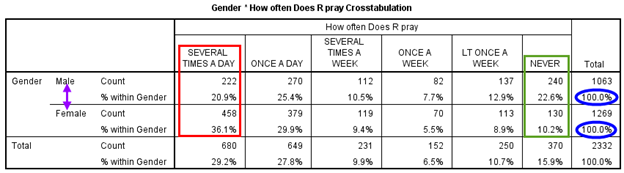
The crosstabs we have shown so far have displayed the independent variable as the column variable. Does a crosstab always have to be done this way? No, and sometimes researchers have good reasons to put the independent variable in the rows—for instance, when the independent variable has many categories, or when they are analyzing multiple independent variables (with crosstabs stacked on top of each other, essentially). That’s because it is generally easier to create tables with numerous rows than numerous columns—for instance, if you were writing a paper, you might have to change the page orientation to landscape mode to accommodate lots of columns.
However, if you choose to make the independent variable the row variable in your crosstab, you must have your data analysis program calculate row percentages. Figure 14.24 depicts a crosstab with the independent variable listed this time in the rows. Note how the title for the crosstab has changed from what it was in the crosstab percentaged by columns, given that the default SPSS title takes the form “[Row variable] * [Column variable] Crosstabulation.”
With percentaging by rows, each row category of the independent variable now adds up to 100 percent (as shown in the blue ovals). We can compare the two IV categories, men and women, across rows within one column of the DV at a time (as shown in the red box for “Several times a day” and in the green box for “Never”). The percentages in this table are identical to those for the same bivariate analysis in Table 14.23–even though we transposed the columns and rows—because we also changed the percentaging.
We’ve given you a quick sense of how researchers go about comparing percentages across groups within a crosstab. Let’s go over how to make sense of crosstabulation results in greater detail. When conducting this analysis, you should ask yourself these questions (what we’ll call our crosstabulation analysis questions):
- Does a relationship exist between the independent and dependent variables? Take a look at the percentages in the cells. Do they differ across categories of the independent variable? For instance, do respondents answer the survey question of interest (your dependent variable) differently depending on their characteristics (your independent variable)?
-
- If no, then stop. No relationship exists between the independent and dependent variables.
- If yes, then a relationship may exist between the independent and dependent variables. Continue with Questions 2 and 3 below.
- Is there a pattern to the relationship between the independent and dependent variables? How exactly do respondents answer the question of interest (your dependent variable) differently depending on their characteristics (your independent variable)? For instance, can we identify a general pattern of higher support for a particular kind of response among respondents from one group?
- If both variables are ordinal-level, is there a direction to the relationship (positive or negative)? We will discuss the direction of relationships later in the chapter.
- What is the strength of the relationship? How closely are the two variables associated with each other? Is the relationship strong or weak?
There are many ways to determine the strength of a relationship between categorical variables. We’ll cover a very simple approach, the percentage-point difference method. Start by deciding which category of the dependent variable is most theoretically important to your analysis. For instance, in the earlier crosstab depicted in Figure 14.23, which had six categories for the DV, you might focus on the “Several times a day” category, the highest possible frequency of prayer. Out of all the DV categories, the percentages of responses that fall into this category (and perhaps the “Never” category as well) should provide the most useful information in helping you determine which group is more likely to turn to religion for comfort—the theory we want to test.
Now that you’ve settled on which DV category to focus on, take a look at the cells associated with that category. If the crosstab’s independent variable has only two values (e.g., male and female), subtract the smaller percentage from the larger percentage; if the IV has three or more values (e.g., ages 18–39, 40–64, and 65 and older), subtract the smallest percentage from the largest percentage. The greater the percentage-point difference, the stronger the relationship between the IV and DV. Roughly speaking, a difference of 5 percentage points or more could signal a relationship worthy of further investigation. (Note that we are speaking here of the percentage-point difference, and not a percentage change.)[5]
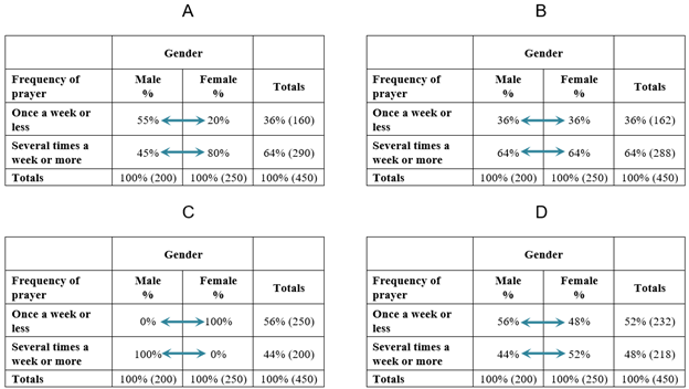
What do the various outcomes described by our crosstabulation analysis questions look like in an actual table? Here’s a hypothetical example showing four possible results for the crosstabulation of gender (IV) with frequency of prayer (DV). The percentages have been chosen to illustrate different scenarios. Remember that gender is measured at the nominal level, and frequency of prayer at the ordinal level. Note as well that we have collapsed the six categories of the frequency of prayer variable to just two so that we can more easily see how men and women differ overall in how often they pray.
Let’s ask our crosstabulation analysis questions of these four tables:
- Does a relationship exist between the independent and dependent variables? Tables A, C, and D show such a relationship. In each, the percentages of men and women who pray several times a week or more are different from one another. Table B is the only crosstab that shows no discernible relationship—that is, no difference between men and women in how often they pray.
- Is there a pattern to the relationship between the independent and dependent variables? In Tables A and D, women are more likely than men to pray frequently. In Table C, men are more likely than women to pray frequently.
- If both variables are ordinal-level, is there a direction to the relationship (positive or negative)? We can’t evaluate direction, since gender is a nominal-level variable.
- What is the strength of the relationship? We’ll use the percentage-point difference method to evaluate the strength of these four bivariate relationships. Because we have collapsed the six categories of the dependent variable to just two—“Once a week or less” and “Several times a week or more”—deciding which DV category to focus on is easy. Either category works fine because the percentage for one of the DV categories will be the inverse of the other. (To use Table A as an example, if 55 percent of men pray once a week or less, then 45 percent must pray several times a week or more, given that those are the only two DV categories.) Since knowing the percentage for one DV category tells you the percentage for the other, analyzing either category gives you the same information, and either can be used to calculate the percentage-point difference. Let’s look at the DV category “Several times a week or more.” In Table A, there is a 35 percentage-point difference between the two genders (80−45=35), in Table B a zero percentage-point difference (64−64=0), in Table C a 100 percentage-point difference (100−0=100), and in Table D an 8 percentage-point difference (52−44=8). Based on these calculations, we conclude that the strongest relationship is found in Table C, followed by A, and then D. In Table B, there is a zero percentage-point difference, indicating there is no relationship between the IV and DV.
Realistically, outcomes like those in Table B (where the percentages are the same across genders) and Table C (where one gender falls entirely in the category of frequent prayer) rarely, if ever, occur in sociology. Some sort of relationship—some sort of difference across values of the IV—is inevitably detectable in the sorts of data we sociologists analyze, given the myriad factors that shape outcomes in the social world. That said, generating the relevant crosstab can usually give us an intuitive sense of how strong a relationship is (including whether it plausibly exists, given the percentage-point differences we actually see). And as we will discuss later, we can also calculate inferential statistics to determine if any differences we do see are likely to be due to a real relationship between the variables in our target population, or if they are quite possibly due to a fluke sample we happened to collect.
At this point, though, focus on figuring out exactly what your crosstab is telling you. Write up a brief interpretation of it that you can insert into the main text of your paper, which should always discuss the key takeaways of any table or chart you include. When summarizing your results, refer back to your answers to the crosstabulation analysis questions we have been using, in addition to keeping these things in mind:
- Before describing any results, state the hypothesis that you are testing with your crosstabulation analysis. (See Chapter 5: Research Design for more advice on constructing hypotheses.)
- To reiterate, a write-up should not mention every percentage in your table. That’s what the table is for! Describe the results that are most important to your research question. For instance, “Several times a day” and “Never” are probably the most theoretically relevant categories in the earlier crosstab of frequency of prayer by gender depicted in Figure 14.23, since they measure the two extremes of greatest and least frequency of prayer. You might not need to mention the other categories, or you might want to consolidate them and just report the collapsed categories.
- In your interpretation of the findings, simplify percentages by rounding to the nearest whole percent. Distinctions on the basis of tenths of a percent are usually too small to make any meaningful difference. If you like, percentages in the table itself can be shown with a single decimal place (in most cases, just one is more than enough).
Let’s go back to the actual GSS data on gender and frequency of prayer. Using the crosstab in Figure 14.23 with column percentages, let’s go through our list of crosstab questions to evaluate the relationship between these two variables:
- Does a relationship exist between the independent and dependent variables? Yes. Men and women show different percentages within categories of the dependent variable, frequency of prayer.
- Is there a pattern to the relationship between the independent and dependent variables? Yes. On the high end of frequency of prayer, 36 percent of women pray several times a day, while 21 percent of men do so. On the other end of the distribution, 10 percent of women never pray, while 23 percent of men do so. Compared to men, then, women are more likely to pray several times a day and less likely to never pray.
- If both variables are ordinal-level, is there a direction to the relationship (positive or negative)? We can’t evaluate direction, since gender is a nominal-level variable in this table.
- What is the strength of the relationship? There is a 15 percentage-point difference between the two genders within the “Several times a day” category and a 13 percentage-point difference within the “Never” category.
So now that we have interpreted the results of our crosstab, how would we go about writing them up in the Findings section of a paper? For summarizing the results of crosstabs and other bivariate analyses, we recommend you follow Miller’s GEE (Generalization, Example, Exceptions) approach described earlier. First, summarize any overall pattern you found. Then provide one or more example statistics that illustrate that pattern. Finally, mention exceptions to the observed pattern (if any). Take a moment now to write up a few sentences to describe the data in Figure 14.23. Then compare your write-up to the wording we suggest in the Exercise “answers” at the end of this section.
Up to this point, we have skipped Question 3 about determining the direction of a bivariate relationship. That’s because one of our two variables (gender) was at the nominal level, which means there cannot logically be a direction to the relationship between that variable and another variable. However, if both of our variables are measured at the ordinal level, we can determine the direction of their relationship. Here, we are looking for one of two patterns:
- If high values of the IV tend to occur along with high values of the DV, we say the relationship is a positive relationship.
- If high values of the IV tend to occur along with low values of the DV, we say the relationship is a negative relationship (also known as an inverse relationship).
Figure 14.26 contains four crosstabs with hypothetical examples of some of the possible relationships between age and frequency of attending religious services. We have measured both of these variables at the ordinal level, which allows us to conduct a crosstabulation analysis that describes the direction of the relationship between them.[6]
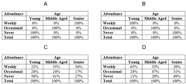
Let’s compare the different relationships depicted in Figure 14.26 by asking some questions about them:
- Which of these tables displays a positive relationship between the independent variable (age) and the dependent variable (frequency of attending religious services)? Tables A and C display a positive relationship between age and frequency of attending religious services. As age increases, frequency of attending religious services increases. Said another way: the higher the age, the higher the likelihood of frequent attendance. The reverse is also true: the lower the age, the lower the likelihood of frequent attendance. In fact, in Table A, the relationship is a “perfect” positive relationship: all seniors have high (weekly) attendance, and all young people have low (never) attendance, with middle-aged people in between. (Again, you will rarely see such extreme results in real life.)
- Which of these tables displays a negative relationship between the independent variable (age) and the dependent variable (frequency of attending religious services)? Tables B and D display a negative relationship between age and frequency of attending religious services. As age increases, frequency of attending religious services decreases. The higher the age, the lower the likelihood of frequent attendance. The reverse is also true: the lower the age, the higher the likelihood of frequent attendance. In fact, in Table B, the relationship is a “perfect” negative/inverse relationship. All seniors have low (never) attendance, and all young people have high (weekly) attendance, with middle-aged individuals in between.
Now that we have covered the basic principles of bivariate crosstabulation analysis, we can use these techniques to evaluate all the comfort theory hypotheses at the same time. Table 14.5 and Table 14.6 display the results of crosstabs for each of the two dependent variables, frequency of prayer and frequency of attending religious services. To keep you on your toes, we’ve put the four independent variables in the rows of each table and percentaged them by rows—a common thing to do, as we’ve noted, when you are analyzing many IVs at the same time. Furthermore, in Table 14.5 we have used the recoded frequency of prayer variable that has just two values.
As you did for the crosstab of frequency of prayer (with six categories) and gender in Figure 14.23, write down a few sentences describing the relationships described in the two tables. Then compare them to the “answers” we have provided after Exercises 1 and 2 at the end of this section (note that these are really suggestions rather than answers, given that there are many perfectly acceptable ways to write up your results). Remember to use the crosstabulation analysis questions we posed earlier to determine the pattern and strength of each relationship (and also its direction if both variables are ordinal-level). Then use the GEE approach (Generalization, Example, Exceptions) approach to concisely describe those results.
Table 14.5. Crosstabulations of Frequency of Prayer by “Comfort Theory” Independent Variables
| Frequency of Prayer |
||||
| Once a week or less | Several times a week or more | n | ||
| Age | 18–39 | 46.6% | 53.4% | 932 |
| 40–64 | 24.8% | 75.2% | 971 | |
| 65 and older | 23.2% | 76.8% | 425 | |
| Gender | Male | 43.2% | 56.8% | 1064 |
| Female | 24.7% | 75.3% | 1270 | |
| Racial identity | Whites | 36.3% | 63.7% | 1547 |
| Nonwhites | 26.7% | 73.3% | 770 | |
| Have a college degree? | No | 32.5% | 67.5% | 1619 |
| Yes | 34.5% | 65.5% | 716 | |
Table 14.6. Crosstabulations of Religious Service Attendance by “Comfort Theory” Independent Variables
| Frequency of Attendance at Religious Services |
|||||
| Once a year or less often | One to three times a month | More than three times a month | n | ||
| Age | 18–39 | 56.9% | 15.5% | 27.6% | 934 |
| 40-64 | 43.3% | 18.8% | 37.9% | 967 | |
| 65 and older | 41.2% | 12.7% | 46.1% | 424 | |
| Gender | Male | 53.4% | 16.0% | 30.7% | 1064 |
| Female | 44.0% | 16.8% | 39.3% | 1267 | |
| Racial identity | Whites | 50.9% | 16.5% | 32.7% | 1547 |
| Nonwhites | 42.9% | 16.3% | 40.8% | 767 | |
| Have a college degree? | No | 51.9% | 14.8% | 33.3% | 1615 |
| Yes | 40.1% | 20.0% | 40.0% | 716 | |
General Tips for Reading Data Tables
Now that we have covered both univariate and bivariate tables, here are some general tips that should help you evaluate all kinds of data tables that appear in academic publications:
- When reading a paper, at least skim over its methods section before you attempt to understand one of its data tables.
- Start by carefully reading the table title first. If it is well-written, it will give you hints about the nature of the variables or types of analyses represented in the table. A table title sometimes includes background information such as the dataset name and year and the target population, all of which can be concisely packed into a single line—for example, “Belief that abortion for any reason should be legal among U.S. adults (GSS, 2018).” That said, these details are frequently provided in the table note instead (see item #4). For bivariate analyses, a common approach is to list the dependent variable first, followed by the words “by” or “as a function of” and then the independent variable: for instance, “Frequency of attending religious services by respondent’s age” or “Frequency of prayer as a function of educational attainment.”
- Read column and row labels to further understand the table contents, paying particular attention to any variables listed. Attempt to piece together the role of each variable in the analysis, including whether the researchers are treating it as an independent or dependent variables (or even as a moderating or mediating variable, as we described in Chapter 3: The Role of Theory in Research).
- Read the table note—the text right underneath the table. If such details were not provided in the title, the table note should prominently indicate the dataset and year (e.g., “Source: General Social Survey, 2018”). It may also convey other important information about the data, such as how key variables were measured, what target population the sample was drawn from, how many cases were in the sample, and how many missing values were excluded from the analysis. For bivariate and other multivariate analyses, the table note should provide a legend (or explanatory text) that describes what thresholds for statistical significance were used for any hypothesis testing (e.g., “* p < .05; ** p < .01; *** p < .001”). In accordance with the legend in the table note, any statistically significant results should be denoted with asterisks or other symbols within the table itself.
- Consider the data analysis technique or techniques represented in the table (e.g., crosstabulation analysis, correlation matrix, regression analysis). The specific methods that researchers used may be described in the table title or table note. Oftentimes, a table that appears complex can be broken down into a series of separate analyses.
- Relate what you see in the data table to the purpose of the study and the concepts that guide it.
Probably the last tip is the most important one. If a table does not contribute to describing or understanding aspects of the social phenomenon being studied, it’s worthless, no matter how fancy the table structure or sophisticated the data analysis techniques. The links between theory and data must be strong in order to provide any truly useful information.
Inferential Statistics: Chi-Square Analysis

So far, we have described patterns within our sample. But in deductive quantitative analysis, we usually want to generalize any results we derive from our sample to our target population. That’s the only way we can test the theories we want to test, all of which must apply to the larger population to be valid.
Can we generalize the results we have obtained through our crosstabulation analysis of GSS data? To answer this question, we can generate inferential statistics that specifically tell us if it is acceptable to use our sample results to make general statements about what’s happening in the target population. However, there is an important condition that has to be met before we can proceed: our sample must have been gathered using probability sampling (as described in Chapter 6: Sampling). If that is not the case, then inferential statistics are not appropriate, and we cannot generalize our sample’s results—no matter how large our sample is, or how great our survey questions were. Fortunately, the GSS sample is a probability sample collected from a target population of American adults, so we can calculate inferential statistics to evaluate whether each of our crosstab results can be applied to the U.S. adult population.
What do inferential statistics tell us? As a thought exercise, imagine that there really is no relationship between gender and frequency of prayer in the U.S. adult population. Men and women pray with the same frequency. If we selected many, many random samples of, say, 2,000 adults from the U.S. population, most of the samples would also show no relationship. No relationship actually exists in the population, and if our selection of respondents is truly random, most of the samples we collect will reflect that fact. But the GSS sample happens to show a relationship between gender and frequency of prayer. Clearly, the sampling was off this time—a rare occurrence with random sampling—because it doesn’t reflect the true situation in the population of interest.
This hypothetical scenario is a risk any time that we conduct a bivariate analysis and observe a relationship between two variables. We need to ask ourselves if we are sure there’s a real relationship in the target population, or if—as in the scenario we just talked about—we happen to have a weird sample that doesn’t represent the target population well. Such an outcome is unlikely if we truly did secure a random sample from our population of interest, but it is still possible, and it raises the risk that we will erroneously conclude based on our fluke sample that a relationship exists in the population.
We’ve just described the basic framework of null hypothesis testing (for a more detailed discussion of this critical concept, refer to the sidebar Understanding Null Hypothesis Testing). A null hypothesis test is a formal procedure for evaluating the hypothesis that there is no relationship between two (or more) variables in the target population. For crosstabulations, the most common null hypothesis test is called the chi-square test (pronounced KAI-square). For our analysis of the relationship between gender and frequency of prayer, the null hypothesis for our chi-square test would be that there is no such relationship in the larger population. If we can reject this idea of no relationship, our argument that the two variables are related in the actual U.S. adult population is strengthened.
Note the careful wording of this statement. With bivariate crosstabulations, we are determining whether or not there is a relationship between the two variables. We are not able to determine if one variable causes the other. Unless we use more advanced methods, we can only detect association or correlation—that is, whether a change in the independent variable is associated with a change in the dependent variable. We can say the two variables are “related,” “associated,” “linked,” or “correlated,” but we cannot say that a change in one causes a “change” in another. As you may recall from our discussions of causality in Chapter 3: The Role of Theory in Research and Chapter 12: Experiments, correlation is a necessary condition for a cause-effect relationship to exist, but by itself it is insufficient for establishing causation. Among other things, we would also need to rule out alternative explanations—perhaps by using multivariate analysis techniques to account for those possibilities, as we will discuss later.
One common standard for testing a null hypothesis is this: reject the null hypothesis if the chance of being wrong is less than 5 percent (.05). This is the conventional threshold for what we call statistical significance—having a high degree of confidence that the relationship we have observed in the data is not due to a sample that by chance does not adequately reflect the characteristics of the target population. Using this threshold, let’s evaluate the hypotheses we’ve derived from the comfort theory of religious participation.
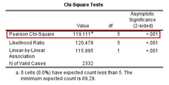
In Figure 14.27 we see the results of a chi-square analysis. This analysis corresponds to the crosstabulation of frequency of prayer by gender that we showed earlier in Table 14.5. (Note that regardless of whether you percentage by columns or rows, the crosstab’s chi-square test will arrive at the same results.) In the first row, which is labeled “Pearson Chi-Square” (the formal name for the test), we see the results of the chi-square test in the columns to the right. The key inferential statistic to consider is the one listed under “Asymptotic Significance.” This is the probability value, or p-value. It estimates the likelihood that we would see patterns as extreme as what we observed in our sample if there truly was no relationship between the two variables in our analysis (i.e., if the null hypothesis was true).
The chi-square test here has found that this chance is extremely low (“<.001”). This tells us that the chance of seeing results this extreme if the null hypothesis was true is less than 1 in 1,000. That’s way below 5 percent (.05). We therefore reject the null hypothesis that gender and frequency of prayer are unrelated in the U.S. adult population.
When we sociologists feel reasonably certain that we should reject the null hypothesis, we say that the relationship is statistically significant. But don’t confuse this term with “important” or “meaningful.” For one thing, the number of cases in the sample affects the results of null hypothesis tests. As your sample size grows larger, every statistic you generate from that sample will be statistically significant. Thus, even if the relationship between two variables is very weak, with a large number of cases you will obtain a statistically significant result for the chi-square test—or, for that matter, for any null hypothesis test. (Refer to the sidebar Understanding Null Hypothesis Testing for more on the distinction between statistical significance and practical significance.)
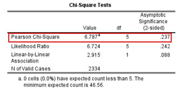
Figure 14.28 presents a chi-square test to go along with the crosstab of frequency of prayer by educational attainment shown earlier in Table 14.5. The p-value on the right tells us there is a .237 (23.7 percent) probability that we would see a pattern as extreme as what we observe in the earlier crosstab—which wasn’t that extreme—if the null hypothesis was true. This figure is higher than .05, so we fail to reject the null hypothesis that the two variables are unrelated in the population. In this case, we very well might have an unusual sample that’s not reflecting the situation in the larger population. Our results are not statistically significant.
Understanding Null Hypothesis Testing
As we have noted at times throughout this textbook, researchers are generally interested in drawing conclusions not about their samples but rather about the populations their samples were drawn from. They calculate frequencies, means, and other statistics from their samples to estimate the corresponding values in the population, what we call parameters (refer back to the discussion in Chapter 6: Sampling). Unfortunately, sample statistics are not perfect estimates of their corresponding population parameters. This is because there is a certain amount of random variability in any statistic from sample to sample. For instance, in our GSS sample we found that 65.5 percent of people with a college degree pray several times a week or more, compared to 67.5 percent of those without a degree—a 2 percentage-point difference. But if we had taken multiple probability samples from the U.S. adult population, we would have likely gotten a slightly different frequency distribution for each one. The 65.5 percent result for college degree holders in the GSS sample might have been 67.1 percent in a second sample, and 64.3 percent in a third—even if these samples had all been selected randomly from the same population. This random variability in a statistic from sample to sample is called sampling error, or random sampling error. (Note that the term “error” here refers to random variability and does not imply that anyone has made a mistake—no one “commits a sampling error.”)
Because of this inevitable variability that occurs across the probability samples we collect, whenever we observe a statistical relationship in our sample, it is not immediately clear to us that there is the same statistical relationship in the target population. As we noted, the GSS dataset showed a 2 percentage-point difference between the percentage of college-educated respondents who prayed several times a week or more and the percentage of non-college-educated respondents who did so. This small difference in prayer frequencies in the sample might indicate that there is a small difference between the corresponding frequencies in the population. But it could also be that there is no difference between the frequencies in the population—that the difference in the sample is just a matter of sampling error.
In fact, any statistical relationship in a sample can be interpreted in two ways:
- There is a relationship in the population, and the relationship in the sample reflects this.
- There is no relationship in the population, and the relationship in the sample reflects only sampling error.
The purpose of null hypothesis testing (also called null hypothesis significance testing or statistical significance testing) is simply to help researchers decide between these two interpretations. One interpretation is called the null hypothesis (often written as H0 and read as “H-zero”). This is the idea that there is no relationship in the population and that the relationship in the sample reflects only sampling error. (A more informal way of stating the null hypothesis is that the sample relationship “occurred by chance.”) The second interpretation is called the alternative hypothesis (often written as H1). This is the idea that there is a relationship in the population, and that the relationship in the sample reflects this relationship in the population.
Again, every statistical relationship in a sample can be interpreted in either of these two ways. The relationship might have occurred by chance because of the sample we happened to collect, or it might reflect a real relationship in the target population. Researchers need a way to decide between these interpretations. Although there are many specific null hypothesis testing techniques (including the chi-square test mentioned earlier), they are all based on the same general logic and follow the same procedure:
- Assume for the moment that the null hypothesis is true: there really is no relationship between the variables in the target population.
- Determine how likely it is that the relationship we observed in the sample would occur if the null hypothesis were true.
- If the observed relationship would be extremely unlikely to occur by chance, then we reject the null hypothesis in favor of the alternative hypothesis. If it would not be extremely unlikely, then we retain the null hypothesis. (Note that social scientists also use this alternative phrasing for the latter idea: “We fail to reject the null hypothesis.)
Following this logic, we can begin to understand why our chi-square test in Figure 14.28 concluded that there is no difference in the frequency of prayer of those with college degrees and those without. In essence, we asked the following question: “If there were really no difference in the U.S. adult population, how likely is it that we would find the small differences we saw in prayer frequency percentages across these two groups in our sample (including the 2 percentage-point difference in praying several times a week or more)?” Our answer to this question was that this sample relationship would be fairly likely if the null hypothesis were true. Therefore, we retained the null hypothesis—concluding that there is no evidence of a difference in frequency of prayer by educational levels in the population.
In turn, it makes sense why we rejected the null hypothesis in the chi-square test depicted in Figure 14.27, concluding that there is a relationship between frequency of prayer and gender in the U.S. adult population. Our null hypothesis test asked, “If the null hypothesis were true, how likely is it that we would find the large differences we saw in prayer frequency percentages across the male and female respondents in our sample (including the 18 percentage-point difference in praying several times a week or more)?” Our answer to this question was that this sample relationship would be fairly unlikely if the null hypothesis were true. Therefore, we rejected the null hypothesis in favor of the alternative hypothesis—concluding that there is a relationship between these two variables in the population.
Through null hypothesis testing, we determine the probability that we would detect a relationship this extreme in our sample if there really was no relationship in the target population. This probability is called the p-value. A low p-value means that a result this extreme in our sample result would be unlikely if the null hypothesis were true, and therefore we should reject the null hypothesis. A p-value that is not low means that a result this extreme in our sample would be likely if the null hypothesis, and therefore we should retain the null hypothesis.
The p-value is one of the most misunderstood concepts in quantitative research (Cohen 1994). Even professional researchers misinterpret it, and it is not unusual for such misinterpretations to appear in statistics textbooks! The most common misinterpretation is that the p-value is the probability that the null hypothesis is true—that the sample result occurred by chance. For example, a misguided researcher might say that because the p-value is .02, there is only a 2 percent chance that the result is due to chance and a 98 percent chance that it reflects a real relationship in the population. This is incorrect. To reiterate, the p-value is the probability we would observe a result as extreme as what we observed in our sample if the null hypothesis were true. So a p-value of .02 means that if the null hypothesis were true, a sample result this extreme would occur only 2 percent of the time.

How low must the p-value be before the sample result we observed is considered unlikely enough that we can reject the null hypothesis? In null hypothesis testing, this threshold is called α (alpha) and is conventionally set at .05. We reject the null hypothesis when our analysis tells us that the chance of observing a sample result this extreme if the null hypothesis were true would be less than 5 percent. If we meet this threshold, the result we obtained from our sample is said to be statistically significant. With a substantial degree of confidence, we can generalize a statistically significant result derived from our sample to the target population.
We retain the null hypothesis when our analysis tells us that the chance of observing a sample result this extreme if the null hypothesis was true is 5 percent or greater. Importantly, this does not mean that the researcher accepts the null hypothesis as true. It only means that there is not currently enough evidence to reject it. This is the reason that researchers use language like “fail to reject the null hypothesis” and “retain the null hypothesis”—but never say they “accept the null hypothesis.”
Why isn’t there enough evidence to reject the null hypothesis? Recall that null hypothesis testing involves answering the question, “If the null hypothesis were true, what is the probability of a sample result as extreme as this one?” The answer to this question depends on just two considerations: (1) the strength of the relationship in the sample, and (2) the size of the sample. Specifically, the stronger the observed relationship and the larger the sample, the less likely it would be for us to encounter this relationship in the sample if the null hypothesis was true. (Likewise, as the strength of the observed relationship and the size of the sample increase, the p-value—which is our measure of that likelihood—falls.)
Our previous examples already gave us a sense of how the strength of the observed relationship directly affects the p-value and thus our decision to reject or retain the null hypothesis. The much stronger relationship between gender and frequency of prayer was highly statistically significant (p < .001, according to our chi-square test), whereas the weak relationship between educational attainment and frequency of prayer was well above alpha (the significance threshold we were using of .05). But the way that sample size also affects the p-value can complicate our analysis. Specifically, sometimes the relationship we observe in the sample can be very weak, but the result will still be statistically significant because our sample happened to be very large. Other times, the observed relationship can be fairly strong, but because our sample happened to be small, the result will not be statistically significant. This latter case is why we say we “fail to reject the null hypothesis,” rather than outright “accepting” it: if we had gathered a larger sample, we very well may have concluded that the fairly strong relationship we observed was statistically significant. (Indeed, given that increasing our sample size always lowers our p-value in this way, we might say that the only time we can “accept” the null hypothesis is when our sample is the entire population!)
Table 14.7 gives you a rough sense of how relationship strength and sample size combine to determine whether a sample result is statistically significant. The columns of the table represent three levels of relationship strength: weak, medium, and strong. The rows feature four sample sizes that can be considered small, medium, large, and extra large in the context of social scientific research. For each combination of relationship strength and sample size, the cells in the table tell us if null hypothesis testing would find the observed relationship to be statistically significant.
Table 14.7. The Statistical Significance of a Bivariate Relationship as Predicted by Relationship Strength and Sample Size
| Strength of the Bivariate Relationships | |||
| Sample Size | Weak | Medium | Strong |
| Small (n = 20) | No | No | Maybe |
| Medium (n = 50) | No | Yes | Yes |
| Large (n = 100) | Maybe | Yes | Yes |
| Extra large (n = 500) | Yes | Yes | Yes |
These predictions are only rough rules of thumb, but the breakdown in the table does show us clearly that (1) weak relationships based on medium or small samples are never statistically significant, and that (2) strong relationships based on medium or larger samples are always statistically significant. If you keep this logic in mind, you will often know whether a result is statistically significant based on the descriptive statistics alone. Developing this kind of intuitive judgment is extremely useful. It allows you to develop expectations about how your formal null hypothesis tests are going to come out, which in turn allows you to detect problems in your analyses. For example, if your sample relationship is strong and your sample is medium-sized, then you would expect to reject the null hypothesis. If, for some reason, your analysis fails to reject the null, then you should double-check your computations and interpretations.
Table 14.7 illustrates another extremely important point that we hinted at earlier: a statistically significant result is not necessarily a strong one. Even a very weak result can be statistically significant if it is based on a large enough sample. For example, social scientists have found statistically significant differences between women and men in mathematical problem-solving and leadership ability, but as Janet Shibley Hyde (2007) points out, the differences speak to quite weak relationships—arguably, trivial ones. The word “significant” in this context can cause people to interpret these differences as strong and important—perhaps even important enough to influence the college courses they take. But that would be a gross exaggeration of what these sorts of weak but statistically significant relationships actually mean.
This is why it is important to distinguish between the statistical significance of a result and the practical significance of that result. Practical significance (also known as substantive significance or—in a treatment context—clinical significance) refers to the importance or usefulness of the result in some real-world context. Many relationships that social scientists uncover between variables are statistically significant—and may even be interesting for purely scientific reasons—but they are not practically significant. For example, a new intervention to reduce gang violence might show that the program produces a statistically significant effect, reducing the local rate of violent crime by 5 percent. Yet this apparent impact on violent crime rates might not be strong enough to justify the time, effort, and other costs of putting the intervention strategy into practice—especially if easier and cheaper programs that work almost as well already exist. Although statistically significant, this result could be said to lack practical significance. As you might have guessed, determining substantive significance is inherently a subjective judgment, but it is vitally important in making sense of the true value and relevance of your research.
Understanding Crosstabs
Journals do not often include bivariate tables in the limited space devoted to articles, instead preferring that researchers describe these results within the text and focus any of their tables on presenting more complex multivariate analyses. However, bivariate analyses like crosstabulations can give us a richer sense of the relationships in our data, and you will occasionally see tables devoted to them in papers.
Figure 14.29 shows a published table including a series of bivariate crosstabulations and their associated chi-square tests. Eunice Kimunai and her collaborators (2016) examined surveys from 167 HIV-positive post-partum women of childbearing age, using data from the 2008–2009 Kenya Demographic and Health Surveys. Their analysis found that women with higher levels of education, literacy, or wealth were more likely to pursue certain types of care to prevent mother-to-child transmission of HIV.
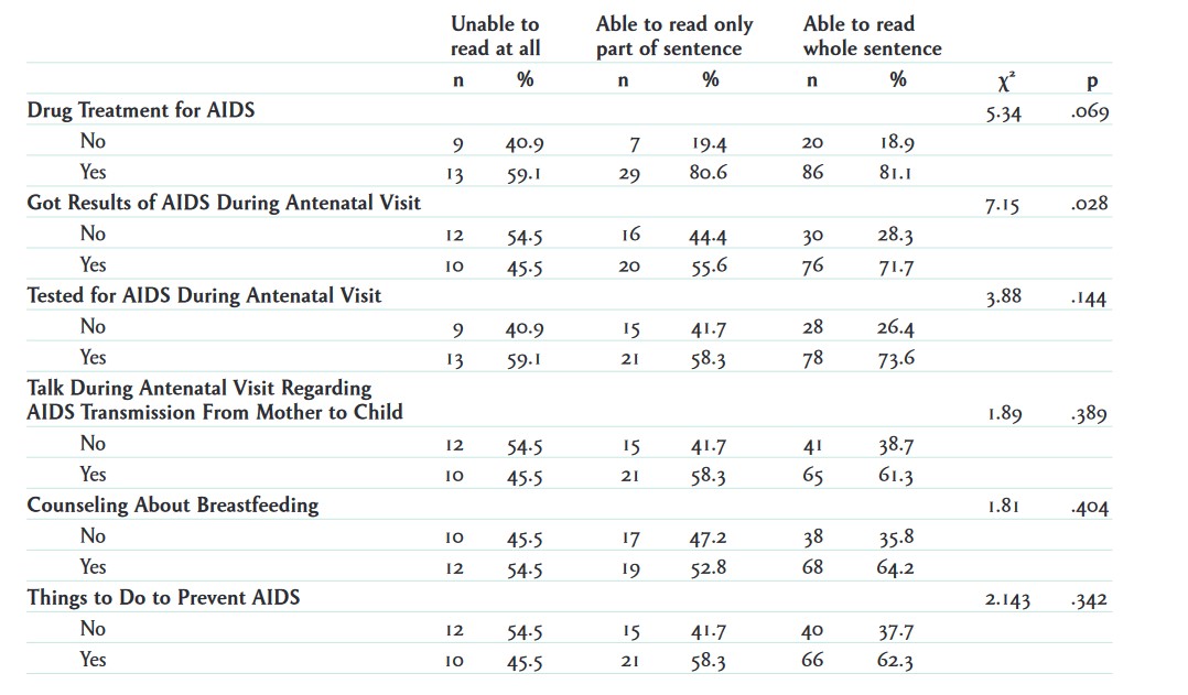
With a crosstabulation, one of your first tasks is to identify which variables are independent variables and which are dependent. The top of the table appears to list different degrees of literacy. There are three levels of literacy and two columns under each: “n” (count) and “%” (percentage). If we read the article, we learn that literacy is the independent variable in this analysis. The researchers wanted to see whether different levels of literacy affected the extent to which women sought out different types of health care. These health care options, the study’s dependent variables, are listed in the rows of the table.
Even if we don’t read through the article text associated with a crosstab, however, we can usually figure out from the table itself which variables the authors are treating as the independent and dependent variables. First, what sorts of relationships between the variables listed in the table make sense theoretically? In our example, are we theorizing that AIDS drug treatment might cause variation in the respondent’s level of literacy? Or that level of literacy might cause variation in the respondent’s access to drug treatment? Just from a logical perspective, the latter is more likely.
Second, the way that the authors have presented their statistics in the table will allow us to infer which variables they are treating as the independent and dependent variables. A crosstabulation table will usually be percentaged by columns if the independent variable appears in the table’s columns, or by rows if the independent variable appears in the rows. How do we determine whether the is percentaged by rows or columns? In the example crosstabs we looked at earlier, SPSS helpfully included “100%” subtotals for each category (in addition to the corresponding count subtotals), which told us exactly how the table was being percentaged. For space reasons, published tables often don’t include percentage subtotals. In situations like these, we should add up all the percentages that are listed in one row of the table, and then add up all the percentages listed in one of its columns. If the percentages add up to 100 percent (accounting for any rounding) for the row you’ve examined, then the table is percentaged by rows; if they do so for the column, it is percentaged by columns.
In the example table, the first column adds up to 100 percent (40.9+59.1=100.0), so the table is percentaged by columns, and therefore the independent variable—level of literacy—appears in the columns. Knowing this, how would you interpret the “40.9” figure in the first row—what is 40.9 percent a percentage of? Remember that when you percentage by column, the denominator for the percentages (the percentage base) is the total for that column—in this case, the 22 women who indicated on the survey that they were “unable to read at all.” (While the table does not list a count subtotal, we know it is 22 because 9 women did not receive AIDS drug treatment—as listed in the first row—while 13 did—as listed in the second row.) Thus, we would interpret the figure this way: 40.9 percent of the (22) women who are unable to read at all did not receive AIDS drug treatment (9 divided by 22 equals 40.9 percent).[7]
In a crosstab percentaged by columns, we should be comparing the percentages across the columns of a single row. Indeed, we see interesting patterns in the example table when we looks across its columns: in the second row, for instance, we find that a lower percentage of women who are unable to read at all (59.1 percent) are receiving drug treatment (the first column), compared to 80.6 percent of those who can read a part of a sentence (the second column) and 81.1 percent of those who can read whole sentences (the third column).
The final important thing to note is the column with our chi-square results, designated by the Greek letter chi (χ2) in the table. (See the earlier discussion of chi-square for details.) The chi-square test for each row tests the null hypothesis that there is no relationship between level of literacy and whatever dependent variable is listed on that row.
Let’s look at the chi-square results on the first row of the table, which relate to whether the respondent received AIDS drug treatment. At the end of this row, the table reports two inferential statistics: the value of the chi-square statistic (5.34) and its p-value (.069). (The chi-square statistic is used to determine the p-value; you can read more about how exactly it is calculated in a statistics textbook.) This chi-square statistic and this p-value are specifically testing the relationship between level of literacy (the table’s one independent variable) and receipt of AIDS drug treatment (the dependent variable listed on the same row). The p-value of .069 tells us that if the null hypothesis were true (i.e., no relationship existed), there would be a 6.9 percent chance of seeing differences this extreme in how likely more and less literate women groups were to receive AIDS drug treatment. That’s higher than the conventional statistical significance threshold of 5 percent, so we cannot reject the null hypothesis.
Going down the rows, we see that the p-value for being tested for AIDS during an “antenatal” (pre-birth) visit is also higher than .05, so we cannot reject the null hypothesis for the relationship between literacy level and that dependent variable, either. However, we can reject the null hypothesis for the relationship between literacy level and receiving the results of an AIDS test at an antenatal visit. These two variables might actually be related in the larger population.
It’s worth a reminder at this point that null hypothesis testing should be conducted only on probability samples. The survey for the example study was conducted using probability-sampling methods, but you will frequently see null hypothesis testing done on nonprobability samples. Avoid that temptation in your own research. If you don’t have faith that your sample is a random sample of your population of interest, any statistics you generate can’t be generalized—even if your p-values are reassuringly low.
How do we summarize the results of a crosstab in prose? Null hypothesis testing complicates how we describe bivariate relationships, so we’ll cover this topic in the separate sidebar Interpreting Inferential Statistics. Note that many of the suggestions there can be applied to other bivariate analyses besides crosstabs.
Interpreting Inferential Statistics
When reporting the results of a crosstab, the first thing to keep in mind is whether or not the null hypothesis test you used found a statistically significant relationship. If there is no statistical significance, you do not want to emphasize the patterns you observed in the sample, because you do not have confidence that those patterns actually exist in the target population (i.e., the analysis failed to reject the null hypothesis). You should state upfront that the relationship between the independent variable and dependent variable is not statistically significant, including a parenthetical notation to specify the threshold you used for statistical significance: e.g., “(p > .05).” Another way of conveying the same thing (i.e., nonsignificance) is to simply state that the dependent variable does not differ across categories of the independent variable. You might note a few key statistics from your crosstab just to describe your results, but it is not worthwhile to go into much depth because any patterns you point out may not actually apply in the target population. If you do mention any observed differences, you will also want to add the caveat that any apparent relationship is likely to be due to random sampling error.
If your analysis found the relationship to be statistically significant (i.e., the null hypothesis was rejected), you can go ahead and interpret the results using the step-by-step GEE (generalization, example, exceptions) approach (Miller 2015). In the “generalization” step, you can explicitly state that the relationship is significant, or you can just add the word “significantly” when describing any patterns: e.g., “We find that older respondents pray significantly more often than younger respondents.” Include the p-value (or the significance threshold that the p-value reached) in parentheses at the end of this sentence: e.g., (p < .001) or (p = .027). Since the relationship is statistically significant, you should mention notable statistics that illustrate the pattern you found (as part of the “example” step). Provide any measures of the strength of the observed relationship, such as percentage-point differences across key cells in a crosstab. However, do not include every statistic listed in the table. Finally, in the “exceptions” step, mention any statistics that violate the pattern you mentioned earlier—for instance, if middle-aged respondents do not fall into the pattern that is seen across the oldest and youngest groups of respondents in your sample.
A special case is when your p-value is slightly above 0.05. For these “marginally significant” cases (p < .1), you might want to mention the sample size and point out that the observed relationship might have been statistically significant if the sample had been larger (see the discussion of sample size in the sidebar Understanding Null Hypothesis Testing).
When you are writing for nonacademic audiences, you can drop the references to p-values, as lay readers will not understand them. Instead, try to break down the concepts into more accessible terms. For statistically significant results, you can state that you have evidence to believe that the relationship between the two variables is not due to chance. You can also indicate that the chances of observing an association this strong in your sample if there were no real relationship between the two variables is “less than 1 in 20” (for a p-value right under the conventional .05 threshold) or “less than 1 in 1,000” (for a p-value under .001).
For nonsignificant results, you should never talk about the existence of any patterns in your data: you do not have strong evidence that these patterns are not due to sampling error. For lay audiences, state that the dependent variable does not differ across the categories of the independent variable, and point out that any patterns or differences observed could have easily occurred through chance alone.
Finally, remember that in any discussion of bivariate results, you should not state that the relationship is causal—for instance, that a change in the independent variable “causes” a change in the dependent variable, or that you have observed the “effect” of the independent variable on the dependent variable. Instead, use more neutral words like “associated,” “correlated,” “related,” and “linked” to describe the connections between variables. Avoid talking about “consequences” or “effects” and describing the independent variable as “causing” or “affecting” the dependent variable—these phrasings imply causality. More broadly, describe your results in a way that acknowledges that alternative factors may be at play, since your bivariate analysis cannot account for other possible explanations for the patterns between the independent and dependent variables that you see.
Key Takeaways
- For a straightforward comparison that is easy to interpret, place your independent variable in the columns of your crosstab and your dependent variable in the rows, and percentage by columns.
- Analyze the strength, pattern, and direction (if using ordinal-level variables) of the relationship depicted by your crosstab.
- In order to generalize the results of your crosstab to the population of interest, you first need to have collected a probability sample. A strong relationship and a larger sample size makes it more likely that your results will be statistically significant, meaning that you can reject the null hypothesis that any relationship you observed was merely due to a fluke sample, rather than an actual relationship in the target population.
- You can use the chi-square test to test the statistical significance of the patterns of frequencies you observe in a crosstab. If the p-value the test generates is lower than your alpha (the threshold for statistical significance, typically .05), then you have confidence that the observed results are not occurring due to sampling error—a sample that, by chance, does not reflect the relevant characteristics of the target population.
Exercises
- Write a few sentences to describe the bivariate relationship between frequency of prayer and gender that is depicted in the crosstab in Figure 14.23. Then compare your write-up to the suggested answers below.
- Write a few sentences to describe the eight bivariate relationships depicted in the crosstabs in Table 14.5 and Table 14.6. Then compare your write-ups to the suggested answers below.
Answers:
- Our hypothesis for the crosstab in Figure 14.23 was that women would have a higher frequency of prayer than men would. Our analysis of the 2018 GSS sample of U.S. adults supported this hypothesis, finding that 36 percent of women prayed several times a day, 15 percentage points higher than the rate for men. Conversely, 23 percent of men said they never prayed, 13 percentage points higher than the rate for women.
- For Table 14.5 and Table 14.6, we hypothesized that the higher a respondent’s age, the higher their frequency of prayer and the higher their frequency of attendance at religious services. In the GSS sample of U.S. adults, older respondents prayed and attended religious services more often, in line with this hypothesis. For example, 77 percent of respondents 65 and older prayed several times a week or more often, compared to 53 percent of those aged 18 to 39, a difference of 24 percentage points. Similarly, 46 percent of those 65 and older attended religious services more than three times a month, compared to 28 percent of those aged 18 to 39, a difference of 18 percentage points.
- We hypothesized that women would have higher frequencies of prayer and attending religious services than men would. In line with the first hypothesis, women prayed significantly more often than men (p < .001): 75 percent of women prayed several times a week or more often, compared to 57 percent of men, an 18 percentage-point difference. (We have included null hypothesis testing results in this particular write-up because they were provided earlier in Figure 14.27.) In support of the second hypothesis, 39 percent of women attended religious services more than three times a month, compared to 31 percent of men, an 8 percentage-point difference.
- Our hypotheses were that nonwhites would have a higher frequency of prayer and a higher frequency of attending religious services than whites would. We observed these patterns in the GSS sample, with 73 percent of nonwhites saying they prayed several times a week or more often, a rate 9 percentage points higher than for whites, and 41 percent saying they attended religious services more than three times a month, a rate 8 percent points higher than for whites.
- Our predictions at the outset of this analysis were that the lower the respondent’s educational level, the higher their frequency of prayer and the higher their frequency of attending religious services. Of respondents with and without college degrees, 66 percent and 68 percent, respectively, prayed several times a week or more often. This 2 percent-point difference across the two education groups was not statistically significant (p > .05); frequency of prayer does not differ by educational attainment. (These hypothesis testing results correspond to the details provided in Figure 14.28.) Our other hypothesis was also not confirmed: college graduates were actually more likely to attend religious services, with 40 percent attending more than three times a month, 7 percentage points higher than the rate for respondents without college degrees.
- This analysis example is an extension of Earl Babbie’s discussion in The Practice of Social Research (2016:49–50). ↵
- Though gender identification is a complex sociological concept, the GSS dataset provides only two binary gender categories, and we will use those two designations for the sake of simplicity. Since the GSS began in 1973, it has only explicitly captured the “sex” of respondents using its sex variable, but in more recent years it has coded the genders of the respondent’s household members with the variables gender1, gender2, gender3, and so on. ↵
- The GSS question asks, “What is your race? Indicate one or more races that you consider yourself to be.” Respondents can choose up to three racial identities, with the first race mentioned in racecen1, the second in racecen2, and the third in racecen3. ↵
- The GSS has two measures of a respondent’s educational attainment: degree and educ. Degree is an ordinal-level variable that indicates the highest educational diploma or degree that the respondent has completed: less than high school, high school, associate/junior college, bachelor’s, and graduate. Educ is a scale-level variable that tells us the highest number of years of formal education completed by the respondent: 0, 1, 2, 3, etc., up to a high of 20. ↵
- The percentage-point difference is calculated just by subtracting the smaller percentage from the larger percentage, and this is the comparison you want to make between two percentages in a crosstab. If you were looking at a change over time, however, you could measure that change either as (a) a percentage-point difference or as (b) a percentage change (calculated as the percentage-point difference between the earlier and later values divided by the earlier value). For instance, if the percentage of women who pray several times a day fell from 36 percent in 2018 to 34 percent in 2022, we could say that the rate of women praying this frequently fell by 2 percentage points, or that it declined by 6 percent (a 2 percent-point difference divided by the earlier value of 36 percent); you could not say it declined by 2 percent. ↵
- Both of these variables could be measured in a scalar form. For example, we could measure the age variable as the respondent’s age in years and the frequency of attending religious services variable as the number of times the respondent attended religious services last month. Collapsing these variables into ordinal-level measures with much fewer categories allows us to use them in a crosstabulation analysis, but it also means that we lose some information—specifically, the ability to tell exact distances between values. ↵
- Yes, we realize we boasted at the beginning of the chapter that we would not include formulas. However, note that we wrote out this formula in prose, without the use of mathematical symbols, which technically means it is not a formula (or at least that’s our story). ↵
